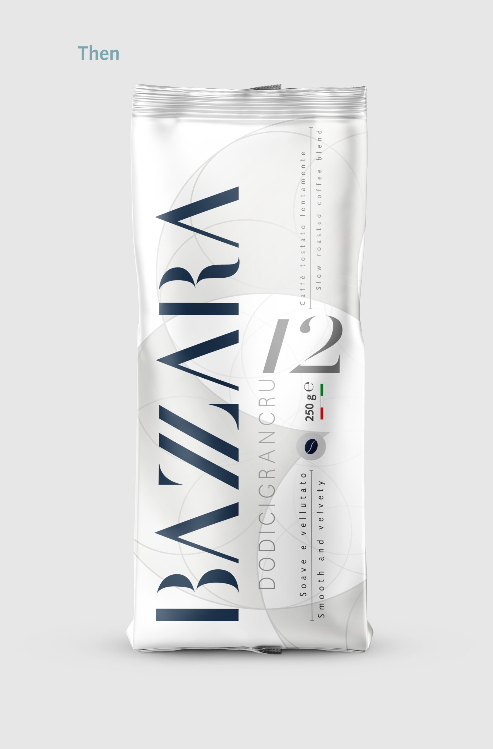
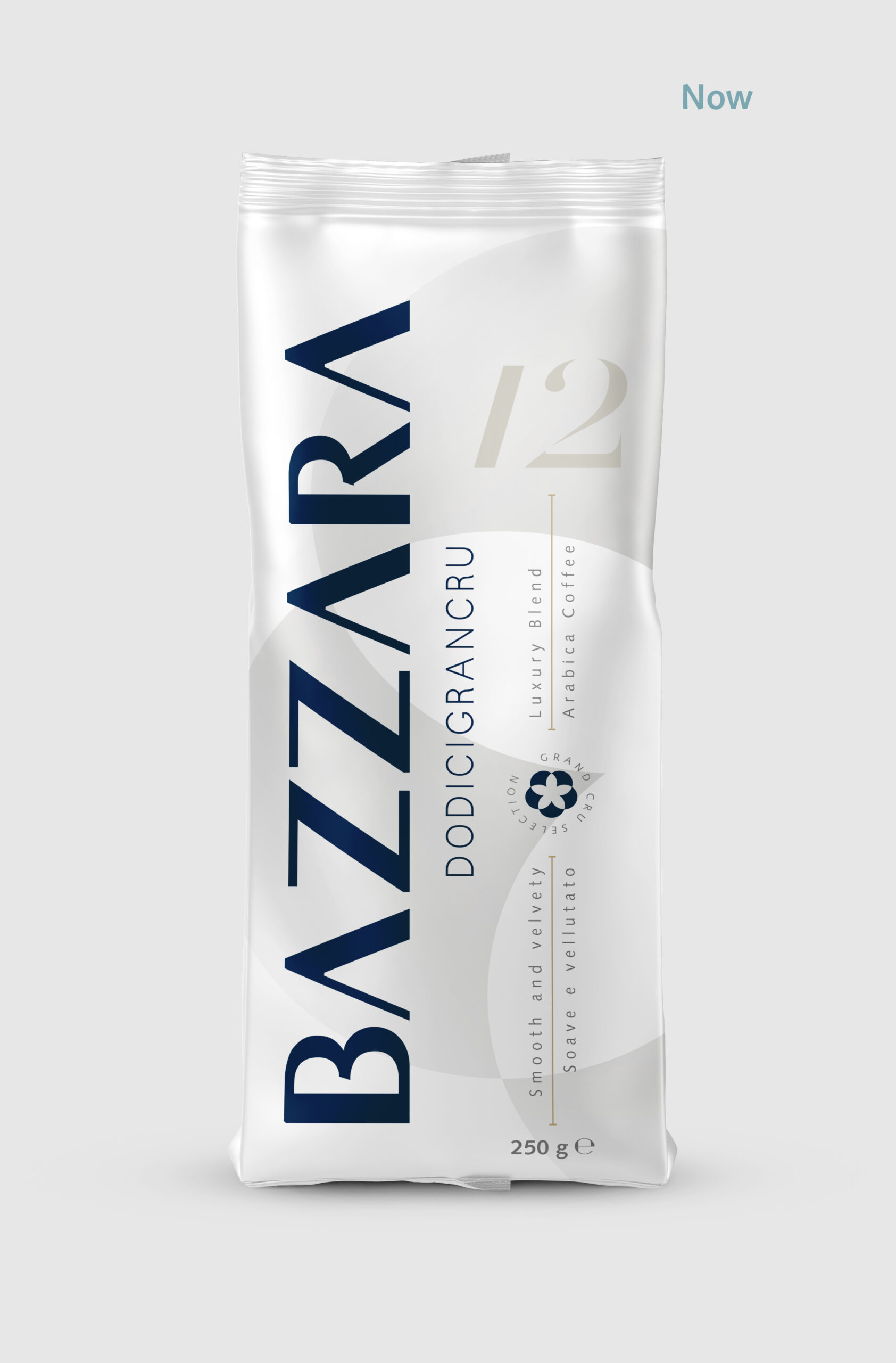
Bazzara redesigns its visual identity, marking a new chapter in its journey through the world of coffee.
Ten years after the rebrand that profoundly reshaped its corporate image, Bazzara continues its path of growth and innovation by unveiling the restyling of its logo.
An evolution that renews the roastery’s visual identity while preserving the values of elegance, craftsmanship, and Italian spirit that have always defined the brand.
Solid, minimalist, and contemporary: the new BAZZARA logotype was born from the desire to make the company’s signature more rational, balanced, and universal — enhancing legibility and visual coherence across all touchpoints, from packaging to digital media.
The new version appears stronger and more modern: proportions have been harmonized, spaces balanced, and the double “Z” refined to ensure better rhythm and readability.
The Luxury line as the first showcase of change.
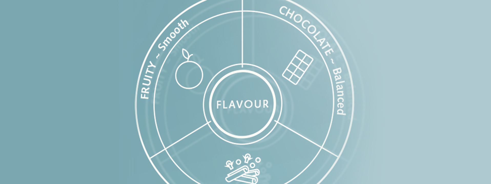
The restyling extends to the Luxury line packaging, now featuring a more essential and international design: wider visual spaces, a universal language for taste descriptors, and a simplified sensory “radar” represented as a clear pie chart with three main descriptors supported by icons.
An evolution looking toward the future.
The logo restyling represents a natural step in the evolution of the Bazzara brand — a mark more in tune with the roastery’s contemporary image, blending design, innovation, and sustainability in every detail.
Not a change of identity, but a stylistic maturation — conceived to enhance the visual and cultural heritage built over time and to accompany the brand into the new challenges of the global market.
Bazzara redesigns its visual identity, marking a new chapter in its journey through the world of coffee.
Ten years after the rebrand that profoundly reshaped its corporate image, Bazzara continues its path of growth and innovation by unveiling the restyling of its logo.
An evolution that renews the roastery’s visual identity while preserving the values of elegance, craftsmanship, and Italian spirit that have always defined the brand.
Solid, minimalist, and contemporary: the new BAZZARA logotype was born from the desire to make the company’s signature more rational, balanced, and universal — enhancing legibility and visual coherence across all touchpoints, from packaging to digital media.
The new version appears stronger and more modern: proportions have been harmonized, spaces balanced, and the double “Z” refined to ensure better rhythm and readability.
The Luxury line as the first showcase of change.
The restyling extends to the Luxury line packaging, now featuring a more essential and international design: wider visual spaces, a universal language for taste descriptors, and a simplified sensory “radar” represented as a clear pie chart with three main descriptors supported by icons.
An evolution looking toward the future.
The logo restyling represents a natural step in the evolution of the Bazzara brand — a mark more in tune with the roastery’s contemporary image, blending design, innovation, and sustainability in every detail.
Not a change of identity, but a stylistic maturation —conceived to enhance the visual a nd cultural heritage built over time and to accompany the brand into the new challenges of the global market.